This afternoon, while waiting on data to load into a Spotfire project, I decided to get a jump on my data limiting series. The series starts with filter panels and data panels, which changed a lot in Spotfire 10 and beyond. I say “beyond” because Spotfire 10.1 was just released. Anyway, I started the post by explaining those changes, which turned out to be quite lengthy. So, I decided to put panel changes in Spotfire X into it’s own post. Read on for more details.
Change Ain’t Easy
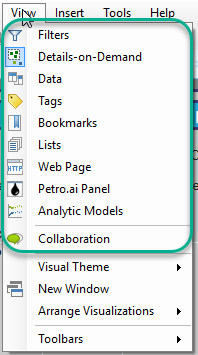
The look and feel of Spotfire changed significantly with Spotfire 10. There is a lot I like about Spotfire 10, but I am not a fan of changes made to the panel and toolbars. The old toolbar was convenient and easy to use. The new interface is disruptive and involves too much clicking. Let me explain.
Panels in Older Versions of Spotfire

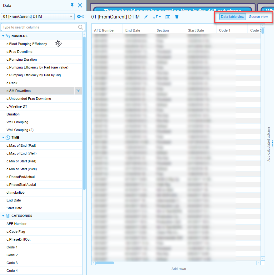
Also, the data panel had a Data table view and a Source view. The Data table view allows you to interact with columns in each table. The Source view maps out the build of a table.
Spotfire 10 and Beyond
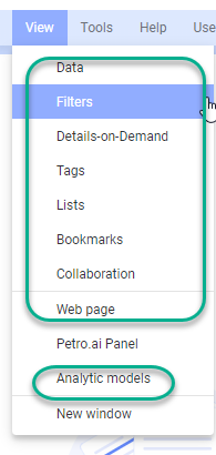
In Spotfire 10 and beyond, access to panels is disconnected. All 9 panels are still in the View menu, but….
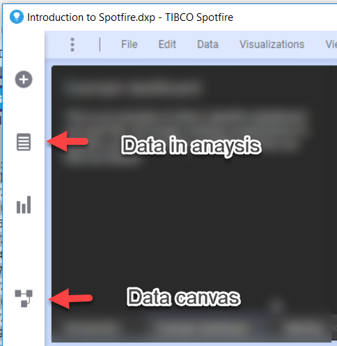
Spotfire 10 splits the Data table view and the Source view of the data panel into a “Data in analysis” icon and a “Data canvas” icon on the left-hand side of the screen. The most annoying change is that users must click into and out of the data canvas by clicking on the
Some of the panels are accessible in the toolbar (shown below), but not all of them. You can only click on Collaboration, Bookmarks, and Filters from the toolbar. To use the other panels, go to the View menu. Personally, I preferred being able to access all panels from the tool bar.

Summary
Spotfire uses 9 panels — Data, Filters, Details on Demand, Bookmarks, Tags, Lists, Collaboration, Web Page, and Analytic Models. In older versions, they were all accessible from the View menu and the toolbar. Users must now know to go to the side of the application for Data. Go to the toolbar for Collaboration, Bookmarks, and Filters. Go to the View menu for Details on Demand, Tags, Lists, Web Page, and Analytic Models.
I know that TIBCO has gone to great lengths to improve the software for new users with features like the Recommendations Engine, but…I don’t think these panel changes are intuitive at all. If you are a new user poking around trying to figure out what all the buttons and features do, this way of organizing the application is detrimental to learning.
For full disclosure, I only have Spotfire 10 installed in a dev environment. I’m not using it for my day to day work. Maybe I’ll appreciate it more once I am working with it full time.
Spotfire Version
Content created with Spotfire 10.0.

Pingback: Part 1 -- Data Limiting with Panels • The Analytics Corner