Skip to content

Spotfire

Limiting Data When Columns Change

This week I worked with one of our engineers on a Spotfire project where he needed to filter out nulls and zeros from his visualizations. This should be easy, but users set the y-axis columns using a property control. Basic data limiting by expression was impossible because the columns kept changing. Limiting data when columns change is challenging but not impossible. There are two ways to do it. Read on to learn more.

Read More »Limiting Data When Columns Change
Calculate the Last Value on a Visualization

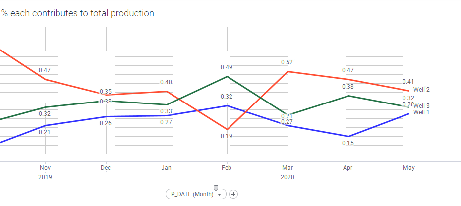
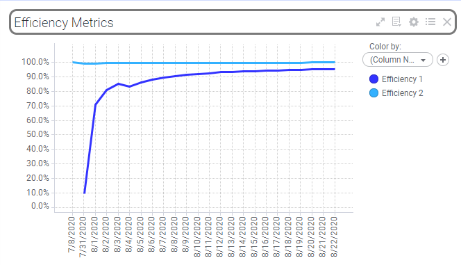
Spotfire’s label functionality leaves a lot to be desired. You can turn on all labels, which will probably clutter the chart since you can’t move labels on most charts. Or, you can mark data points to see select labels. None of this is helpful if you want specific labels on an exported report, which is where I found myself last week. To get around Spotfire limitations and still fulfill my customer requirements, I opted to add a text area with a calculated value above my visualization. This allowed me to calculate the last value from a visualization without dealing with labels. My calculation was cumulative, so I expected that if I used the same calculation, the end result would be the last value on my visualization. It was not. Even TIBCO support was stumped as to why this didn’t work. Read on to learn a little bit more about calculated values and the Spotfire expression language.

Read More »Calculate the Last Value on a Visualization

How to Improve Spotfire Load Times

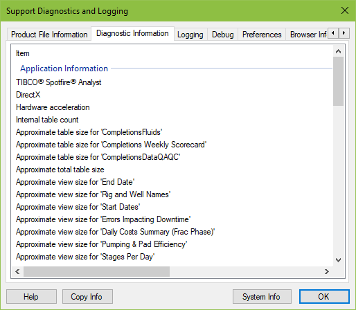
Long load times are a problem all Spotfire users struggle with eventually. The first step to reducing load time involves understanding which tables are taking the longest to load. Spotfire provides this information in the Help menu, but it’s not in a form that is easy to work with. This week, I need to help one of our project teams optimize their Spotfire project, so I built an Excel template to parse this data. Now I know what to go after in order to improve Spotfire load times.

Read More »How to Improve Spotfire Load Times

Spotfire Axis Names on Line Charts

If you’ve been following along, you know that my series on learning the Spotfire expression language is something of a long haul. It turns out that explaining Axis Names is a long and detailed affair. I am committed to it, and so this week I’m going thru axis names for line charts. If you missed it, check out Axis Names on Bar Charts.

Read More »Spotfire Axis Names on Line Charts

Use TERR to Dynamically Update Visualization Titles

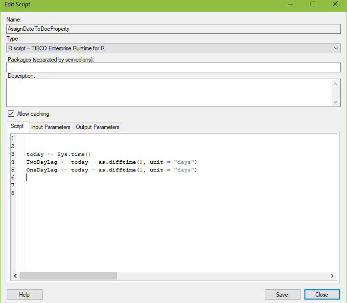
This week, I worked with our production team to create a downtime dashboard. The dashboard only brings in allocated data, which has a two-day lag. It makes sense to include the date of the most recent data in the visualization title. This task can be accomplished with TERR, JavaScript, or Python. I chose TERR for my project, so this post will show you how to use TERR to dynamically update visualization titles.

Read More »Use TERR to Dynamically Update Visualization Titles

Using Document Properties to Control Data Limiting by Expression

I love data limiting with expressions! It is my go-to method for data limiting because it is the most flexible. However, I found myself updating expressions over and over in tons of charts. It was just inefficient and painful. Then, I learned how to connect document properties to my expressions. Now, I know how to be more efficient in my data limiting. I promise this is worth your time! Read on to learn more.

Read More »Using Document Properties to Control Data Limiting by Expression

Spotfire Axis Names on Bar Charts

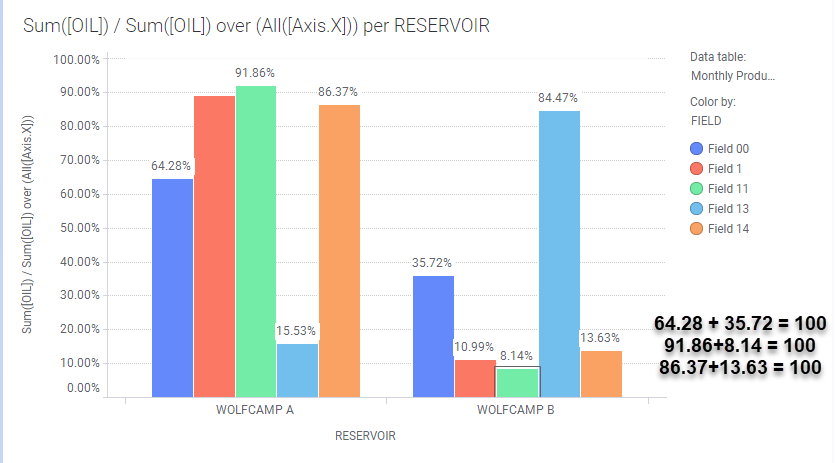
Last week, I introduced the concept of Axis Names. If I counted correctly, there are 19 axis names applicable to one or more of the 14 visualizations in Spotfire. I will go through the axis names one visualization at a time, beginning with axis names on bar charts. Although, I learned very quickly that just because you can use an axis name on a given visualization, it doesn’t mean you should. I’ll show you what I mean by looking at Axis.X and Axis.Color. Read on to learn more.

Read More »Spotfire Axis Names on Bar Charts

Positioning Labels on Feature Layers in Spotfire Maps

A user reached out to me asking for help with labels on a feature layer in a map chart. At first, I thought he wasn’t seeing the label, which is a common problem. Actually, he needed help positioning labels on feature layers. It used to be the case that you couldn’t move map chart labels, but that has changed. It is now possible to move labels on feature layers, but it’s not as easy as a right-click. Read on to learn the steps.

Read More »Positioning Labels on Feature Layers in Spotfire Maps

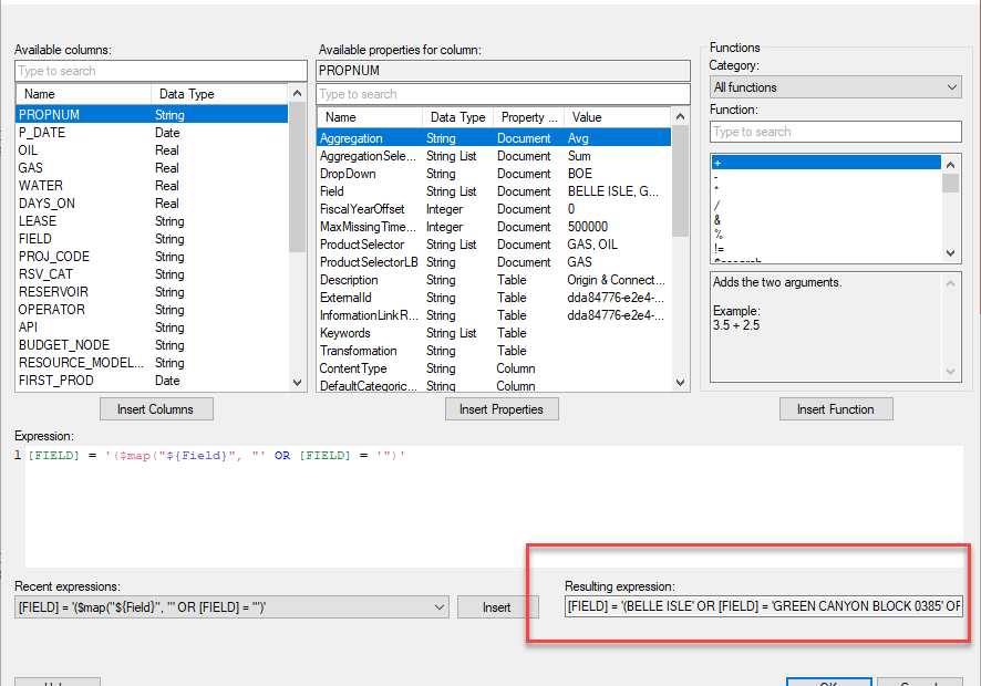
$esc and $map Functions in Spotfire

A while ago, I started a series on learning the Spotfire expression language. I made a lot of progress on it but got pulled off on a few side quests. This week, I return to that theme with an explanation of how to use the $esc and $map functions in Spotfire. Knowing how to use these functions will allow you to connect visualizations to property control to provide a more interactive experience for users. It will also give you greater insight into how Spotfire expressions really work. Read on if you want to be able to…

  • Create dynamic visualizations that update with changes to property controls.
  • Use data limiting with property controls.
Read More »$esc and $map Functions in Spotfire