Skip to content

bar charts

Why Do Counts Aggregate Differently in Spotfire?

Last week, I wrote a post on using Axis Names on Cross Tables. My examples calculated the difference in Amounts between two scenarios on a cross table. I also needed to know the difference in well counts between scenarios, this time on a bar chart. But, when I changed the aggregation from a Sum to a CountDistinct, the calculations didn’t work anymore. That is because counts aggregate differently than the other aggregation methods. Read on if you want to get your counts right!

Read More »Why Do Counts Aggregate Differently in Spotfire?
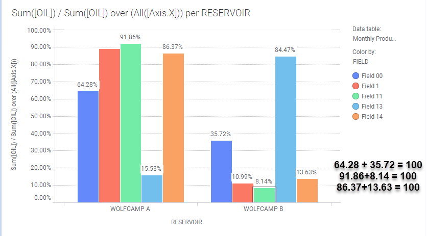
Spotfire Axis Names on Bar Charts

Last week, I introduced the concept of Axis Names. If I counted correctly, there are 19 axis names applicable to one or more of the 14 visualizations in Spotfire. I will go through the axis names one visualization at a time, beginning with axis names on bar charts. Although, I learned very quickly that just because you can use an axis name on a given visualization, it doesn’t mean you should. I’ll show you what I mean by looking at Axis.X and Axis.Color. Read on to learn more.

Read More »Spotfire Axis Names on Bar Charts

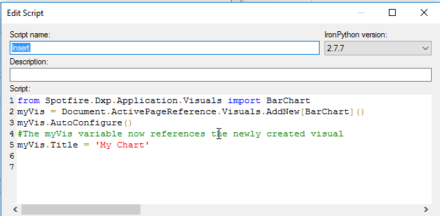
Add Bar Chart with IronPython

This is my third week working thru IronPython scripts from the Spotfire IronPython quick reference. Last week, we looked at for loops. The week before, we used IP to modify titles. This week, we’ll insert visualizations with IronPython and explore the API as we go. We’ll get started learning how to add a bar chart with IronPython to an analysis.

Read More »Add Bar Chart with IronPython