Skip to content

custom expressions

Why Do Counts Aggregate Differently in Spotfire?

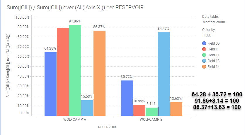
Last week, I wrote a post on using Axis Names on Cross Tables. My examples calculated the difference in Amounts between two scenarios on a cross table. I also needed to know the difference in well counts between scenarios, this time on a bar chart. But, when I changed the aggregation from a Sum to a CountDistinct, the calculations didn’t work anymore. That is because counts aggregate differently than the other aggregation methods. Read on if you want to get your counts right!

Read More »Why Do Counts Aggregate Differently in Spotfire?

Data Limiting with Expression versus Show Hide

A few weeks ago, I wrote a post on data limiting in Spotfire when column names change. I provided solutions using both data limiting with expression and the Show Hide Items function. I struggled to get working solutions in both because I expected them to work the same way, but they do not. Therefore, this week, I developed a comprehensive tutorial to show you what they can do and how they are different. Read on to learn more.

Read More »Data Limiting with Expression versus Show Hide

Troubleshooting Custom Expressions in Spotfire

Working with custom expressions in Spotfire can be tricky. You try different combinations of syntax and just get errors. Sometimes the error message is helpful, but often it is just jibberish. How do you know exactly what’s getting passed thru the expression? There is a way to find out. Check out this short post for a solid pro-tip on troubleshooting custom expressions in Spotfire.

Read More »Troubleshooting Custom Expressions in Spotfire

Limiting Data When Columns Change

This week I worked with one of our engineers on a Spotfire project where he needed to filter out nulls and zeros from his visualizations. This should be easy, but users set the y-axis columns using a property control. Basic data limiting by expression was impossible because the columns kept changing. Limiting data when columns change is challenging but not impossible. There are two ways to do it. Read on to learn more.

Read More »Limiting Data When Columns Change

Calculate the Last Value on a Visualization

Spotfire’s label functionality leaves a lot to be desired. You can turn on all labels, which will probably clutter the chart since you can’t move labels on most charts. Or, you can mark data points to see select labels. None of this is helpful if you want specific labels on an exported report, which is where I found myself last week. To get around Spotfire limitations and still fulfill my customer requirements, I opted to add a text area with a calculated value above my visualization. This allowed me to calculate the last value from a visualization without dealing with labels. My calculation was cumulative, so I expected that if I used the same calculation, the end result would be the last value on my visualization. It was not. Even TIBCO support was stumped as to why this didn’t work. Read on to learn a little bit more about calculated values and the Spotfire expression language.

Read More »Calculate the Last Value on a Visualization

Spotfire Axis Names on Line Charts

If you’ve been following along, you know that my series on learning the Spotfire expression language is something of a long haul. It turns out that explaining Axis Names is a long and detailed affair. I am committed to it, and so this week I’m going thru axis names for line charts. If you missed it, check out Axis Names on Bar Charts.

Read More »Spotfire Axis Names on Line Charts

Using Document Properties to Control Data Limiting by Expression

I love data limiting with expressions! It is my go-to method for data limiting because it is the most flexible. However, I found myself updating expressions over and over in tons of charts. It was just inefficient and painful. Then, I learned how to connect document properties to my expressions. Now, I know how to be more efficient in my data limiting. I promise this is worth your time! Read on to learn more.

Read More »Using Document Properties to Control Data Limiting by Expression

Spotfire Axis Names on Bar Charts

Last week, I introduced the concept of Axis Names. If I counted correctly, there are 19 axis names applicable to one or more of the 14 visualizations in Spotfire. I will go through the axis names one visualization at a time, beginning with axis names on bar charts. Although, I learned very quickly that just because you can use an axis name on a given visualization, it doesn’t mean you should. I’ll show you what I mean by looking at Axis.X and Axis.Color. Read on to learn more.

Read More »Spotfire Axis Names on Bar Charts